Forum moved here!

Home / Toolbar text color [Fixed in Pre-Release 3.4.14175]

chameleon

I use a custom dark theme on windows 7.
So, I set “3D OBJECTS” in windows 7 to be very-dark-gray for background and very-light-gray for text.
SumatraPDF toolbar uses “3d objects” background for background and BLACK for text.
So, I barely see the TOTAL PAGES of PDF.

I know that Windows 10 does not use Windows 7 color scheme, so you must cross-check it.

GitHubRulesOK

Probably related to:

Perhaps best to include a screenshot and description of related settings there.

chameleon

Wow!
There is an option!
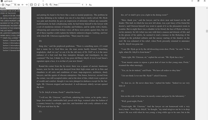
But when I change it from #000000 to #ffffff, then bookmarks and pdf content text become white too.
Separate color for “page:” “find” from PDF text and contents.

GitHubRulesOK

This issue has now been addressed in latest 3.4 pre-release.

hover

Why was this coloring epub UI removed from daily build ?

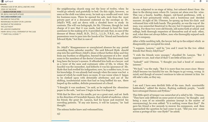
Sumatra 3.3:

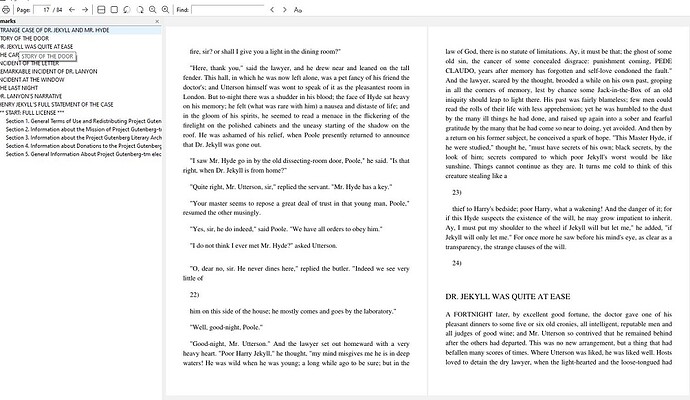
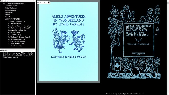
Sumatra pre-release build version 14176:

GitHubRulesOK

The old eBook 1 engine was removed some time ago (before3.3.3 bug fix but change was deferred to 3.4 pre-release) as there was a shift to use the core MuPDF rendering engine for better ePub support, it is still based on a limited range of ePub 1 features rather than ePub 3 but provides one common interface, renders better and supports more txt types such as html and xml

hover

Could you add same color profiles for epubs to daily builds?

GitHubRulesOK

The same salmon background colour #fbf0d9 should work in fixedUI but will then also colour PDF backgrounds too :slight_smile:

hover

Could you allso add that blue line bar and page numbers which indicates it in daily build?

GitHubRulesOK

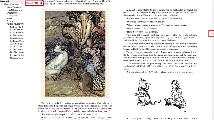
The “numbers” are the ones that started this discussion they were invisible when toolbar text was white on light if users started changing text colours. You can also use SHIFTED I in full screen mode (see below) :slight_smile:
The horizontal blue progress bar was the page progress indicator equivalent to the vertical scrollbar in the standard UI thus you need to be in continuous page mode (C with scrollbars on) see box on the right of screen.

hover

Coloring doesn’t work seamlessly in daily build.

3.3 version is more tuned by default. Could you make daily build 3.4 like that.

GitHubRulesOK

the colouring is only for page canvas and bookmarks area
UI colours are Windows System defaults (thus can be customised by Windows Apps like “Blinds”) the “gap” between pages can be reduced in advanced settings
PageSpacing = 0 0
and the canvas altered using GradientColors = #000000 (you only need to add the one #000000 value it is 3 max for say red, white and blue)

hover

Yes, but 3.4 should improve and make things easier and looking nice. This feels like a regression, not improvement.